GSG, Pathfinder and Arkhon | Brand Development
From gateway to path: a brand family for a digital asset business
Client: Great South Gate (GSG), a crypto asset management and brokerage firm in Singapore
The work: GSG masterbrand rebrand · Pathfinder and ARKHON sub-brands, built from the ground up
Pathfinder: Private-client digital asset brokerage and app for family offices, institutions and high-net-worth investors across Asia
ARKHON: Institutional SaaS platform helping banks and wealth managers enter digital assets
Role: Creative Director / Brand Lead - 1 year Contract
Team: Led the design and Brand development working closely with Founders and CTO and Dev team
Timeframe: 2022 -2023
Scope: Brand strategy · Brand architecture · Identity · Motion · Website · Brand framework
The challenge
GSG was growing from a crypto asset manager into a broader business, with institutional funds and two new products. Its brand needed to keep pace, without losing the recognition its original logo had built.
Each new product faced a different audience:
Pathfinder, a private-client brokerage, served family offices, institutions and high-net-worth investors across Asia. They were sophisticated and cautious, and expected the trust of the global banks GSG's leadership came from.
ARKHON, an institutional SaaS platform, sold to traditional banks and wealth managers who wanted to offer digital assets to their own clients. They needed to see enterprise-grade technology they could build their business on.
The task was three brands, three audiences and one story: a confident masterbrand and two sub-brands, each speaking clearly to its own market while staying recognisably part of the GSG family.
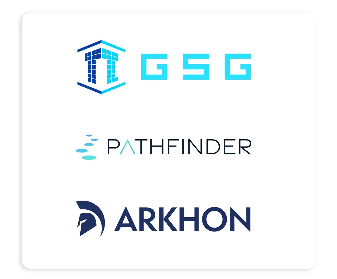
The idea: gateway, path and foundation
The three brands share one story: a way into digital assets, a guided path for private investors, and the infrastructure that lets other institutions follow. [
GSG: the gateway
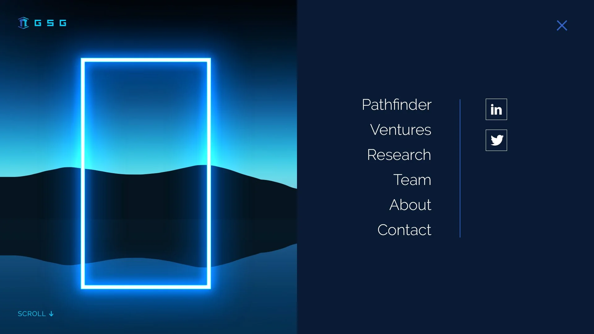
The idea. Drawing on the Great South Gate name, I evolved the identity around a bold gateway theme inspired by "degen" crypto culture. It speaks to a digital-native audience with confidence and energy, while keeping enough of the original logo to protect recognition.
The development. I explored several creative directions for the masterbrand, testing how far the identity could move while staying recognisable. The gateway route was the one the team responded to most strongly.







The idea. Pathfinder's stepping-stone mark shows private clients a clear, secure route into an unfamiliar asset class, one considered step at a time. The tone is calmer and more refined than GSG's, giving cautious investors the reassurance they need.
The development. I designed the Pathfinder identity myself, taking it through 3 rounds of development. Each round refined the mark for clarity at small sizes, especially as an app icon, and for the precision and calm of an institutional finance brand.



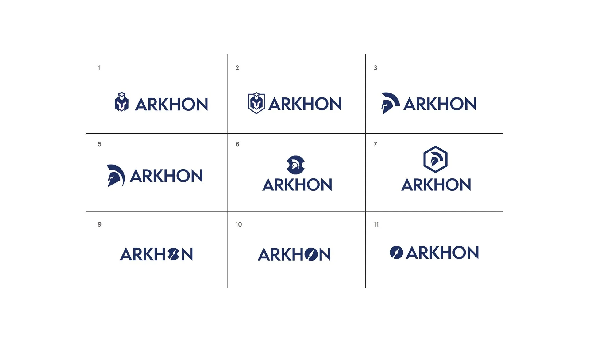
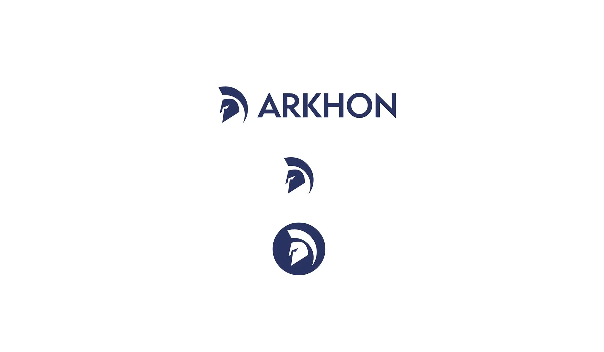
The idea. The name draws on the Greek archon, the magistrates trusted to uphold order in ancient Athens, and was chosen to stand for security and integrity. The logo is based on a classic Greek helmet, creating a distinctive mark associated with integrity and fortification: exactly what a bank or wealth manager needs before building its digital asset business on someone else's platform.
The development. I developed the helmet mark to feel solid, protective and enterprise-grade, while keeping it recognisably part of the GSG family.